Introduction
Quebec is gradually reverting to life before the COVID-19 outbreak after dealing with the pandemic for almost three years. It is impossible to overlook the aftereffects of COVID-19 and how they continue to affect us even as COVID-19 nears its end. The people of Quebec have observed that many products have grown more expensive due to inflation as they attempt to get their lives back to normal after the pandemic. In an attempt to lessen the negative effects of high inflation, the government of Quebec has recruited our team to create an app for the restaurant "Flavors", which is situated in the center of downtown and is close to Concordia University. After extensive investigation and analysis of the effects of inflation, it was determined that the ideal solution would be an addition of a cashback feature to the app.
Problem
The COVID-19 epidemic and, more recently, major world events like the Ukraine War, have had a significant impact on consumer pricing. Consumer price index (CPI) inflation in Canada was 2.2% prior to the pandemic in 2020, which is the average rate that the Bank of Canada strives to maintain. However, the inflation of goods has risen to 4.7%, which is more than double the average. Due to this, customers are finding it difficult to pay for even their most basic needs. Increased grocery prices, in particular, have had a negative impact on restaurant revenue because most people cannot afford to eat out as frequently as they used to, yet businesses have no alternative but to raise rates due to rising material prices (food/grocery prices). We performed a poll to better understand the demographics of the users we were hoping to reach, and the results indicate that 87% of respondents believe that inflation has reduced the frequency of eating out as compared to before the pandemic (Figure 2). At the same time, many acknowledged eating out at least once a week for a variety of reasons such as a lack of time to cook, a break from homemade food, and so on (Figures 3 & 4). We deduced from the data and outcomes of the user poll that many consumers believe food prices have risen yet are frequently bound by circumstances to buy food regardless of their budget.
Solution
Our design firm has been contracted by the Quebec government to address the issue described in detail above. It is obvious that the main problem that has to be resolved is to make dining out at restaurants affordable and reverse the negative impacts of inflation on the restaurant industry. However, finding the functionalities we need to help consumers accomplish these goals and feel amazing while doing so, is a challenging task. Our team employed a variety of methodologies to arrive at the solution, including user personas, user journeys, surveys of the target audience, and user research to identify the most prevalent user concerns and, most crucially, their feelings. After carefully examining all the information we had collected, it was decided that the best method to assist our consumers would be to add a cashback feature to the app and let users rate the service they received and the quality of the meal. In addition, our team also discussed the typography, colors, and logos we will employ to ensure that customers have a positive experience when browsing the application we are creating.
Surveys
We prepared a survey with Google Forms to better understand the needs of our potential users. The results of this survey will help us analyze the expectations for the application and most significantly, assess the impact that inflation has had on that aspect of their lives.
The highlights of our survey show that, as anticipated, the majority of respondents were affected by inflation, which in turn affected the amount of time they ate outside. To counter this, 91.7% of the people questioned think that discounts enable them to make savings on their daily meals.
Additionally, about 70% of respondents think that receiving discounts or deals will encourage them to eat at restaurants.
We may be able to gather data more quickly and efficiently to support our UX design by using surveys. Participants were anonymous, and there were 7 questions on the multiple-choice form. Below is a list of some of the most important data.
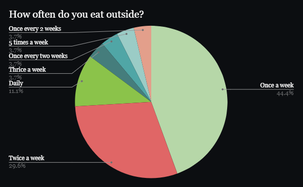
Figure 1
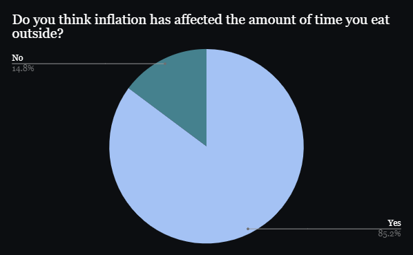
Figure 2
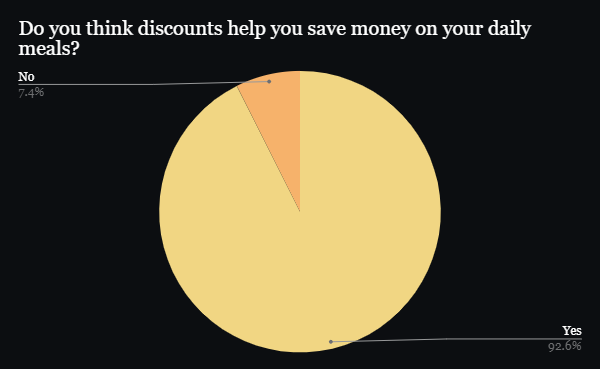
Figure 3
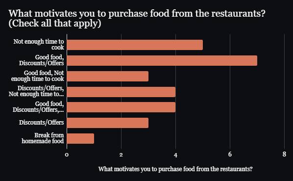
Figure 4
User Personas
The user personas were divided into three groups based on the research information our team gathered to better understand the demands of the users. Following a thorough examination of each group, we found that user requirements vary greatly depending on each person's priorities, ambitions, skills, and frustration.
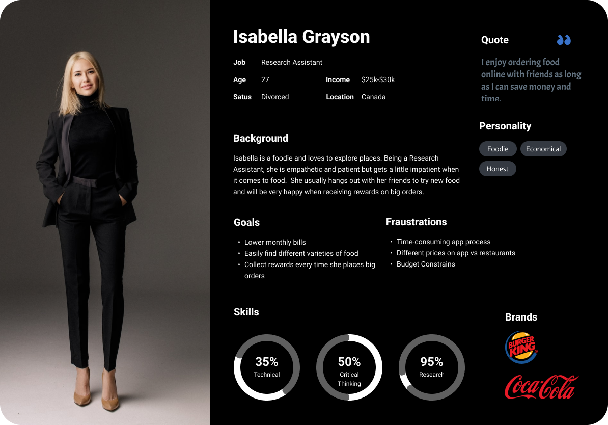
Persona #1: Our first persona, Isabella Grayson, is a hard-working employee who spends the majority of her time at her office located downtown. Isabella loves sitting and talking with her friends, as she isn’t able to do that often with her demanding work schedule. Isabella is an adamant believer that food brings people together and enjoys bonding with friends and family over a delicious meal. Isabella aims to treat her friends and family every so often by placing big orders from an online delivery app, in hopes of earning rewards.
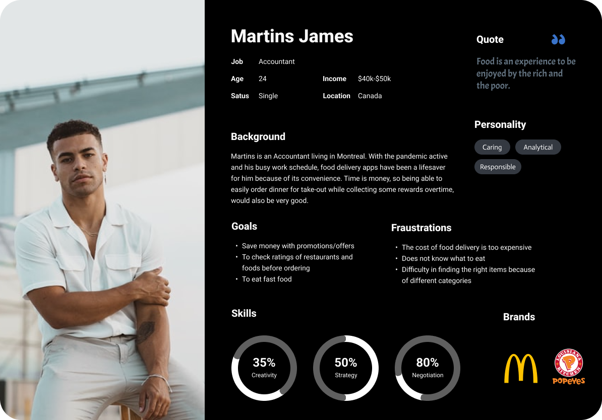
Persona #2: The second persona, Martins James, works at a local accounting firm and because of his hectic and unpredictable schedule, meal planning isn’t his priority. Martins is very selective of the food he eats, and he frequently finds himself meticulously reviewing ratings before placing any orders. As an accountant, Martins tends to be frugal when spending his own money, hence, he would like to save money on his orders.
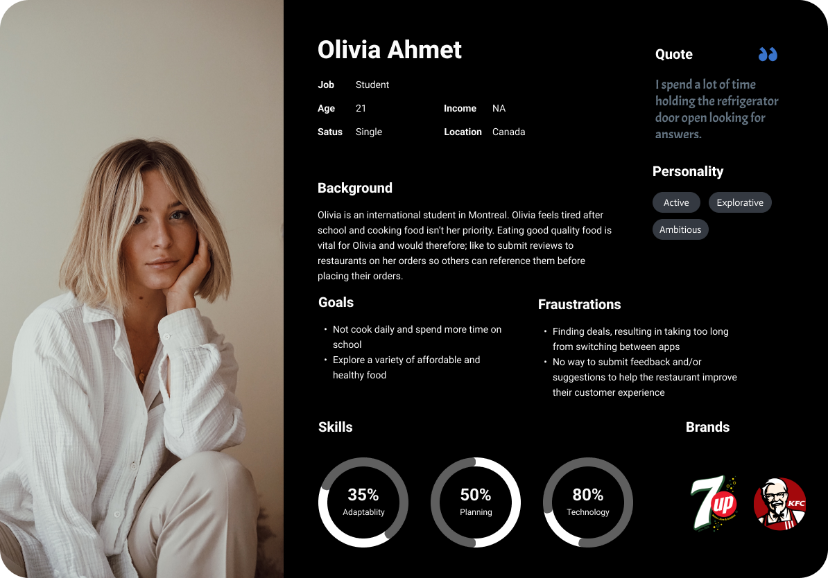
Persona #3: Finally, our third persona is Olivia Ahmet. Olivia is an international student from Turkey who is currently completing her second year of Software Engineering at Concordia University. Olivia is a full-time student, who spends a majority of her time attending lectures and commuting to school. As a result, Olivia finds adjusting to life in Canada challenging because she has no family to rely on and must cook and care for herself. Olivia frequently orders food online because of her busy schedule, but because she did not grow up here and had a number of unpleasant experiences with restaurants, she makes sure to write reviews about her experience to help other students who may be in the same situation as her.
User Goals
It is crucial to comprehend customer objectives because they heavily influence the outcome of the design. Our team was able to identify several key user requirements by using user personas and surveys. Since the target audience consists primarily of students and office professionals who are both extremely busy and on a tight budget, especially in the aftermath of the pandemic, their key objectives while dining out were the following:
Primary Goal: Save money while eating out at restaurants
Secondary Goal: Read and submit reviews about past customers' experiences.
While keeping these objectives in mind at all times, it was determined that the best features to include would be cashback and a review component to satisfy user needs.
User Journey
The next step was to construct a user journey map in order to imagine the application from the perspective of the user and to describe how they interacted with it. This method allows us to understand the users' feelings at every stage of the application's use, allowing us to identify and improve on features that could suit their needs. The experience of Martins James, one of our user personas, is depicted in the journey map below.
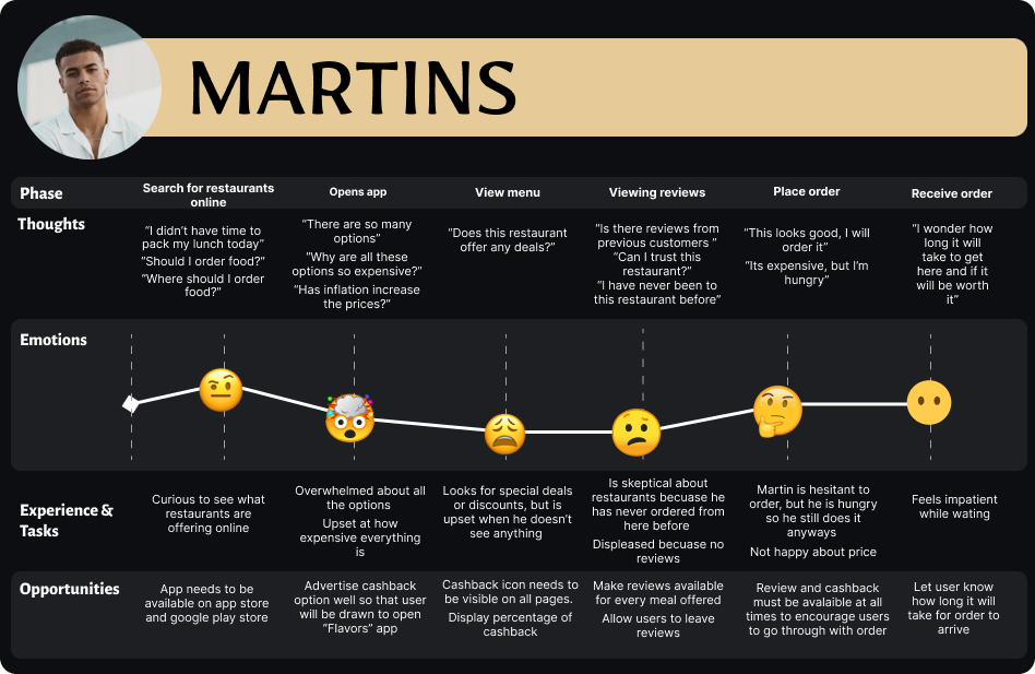
We may conclude from this user journey that Martins was annoyed by the outrageous prices and angry that there were no reviews available. We decided that our application should offer cashback to customers and also make reviews available for all options on the menu.
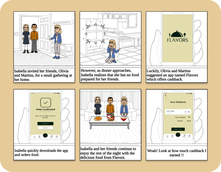
Storyboard
Storyboarding is an excellent method for visually demonstrating the context in which the service can be used as well as the emotions that the user may be experiencing. This scenario narrates the story of our user persona Isabella Hunter who has invited her friends Olivia and Martins to lunch.
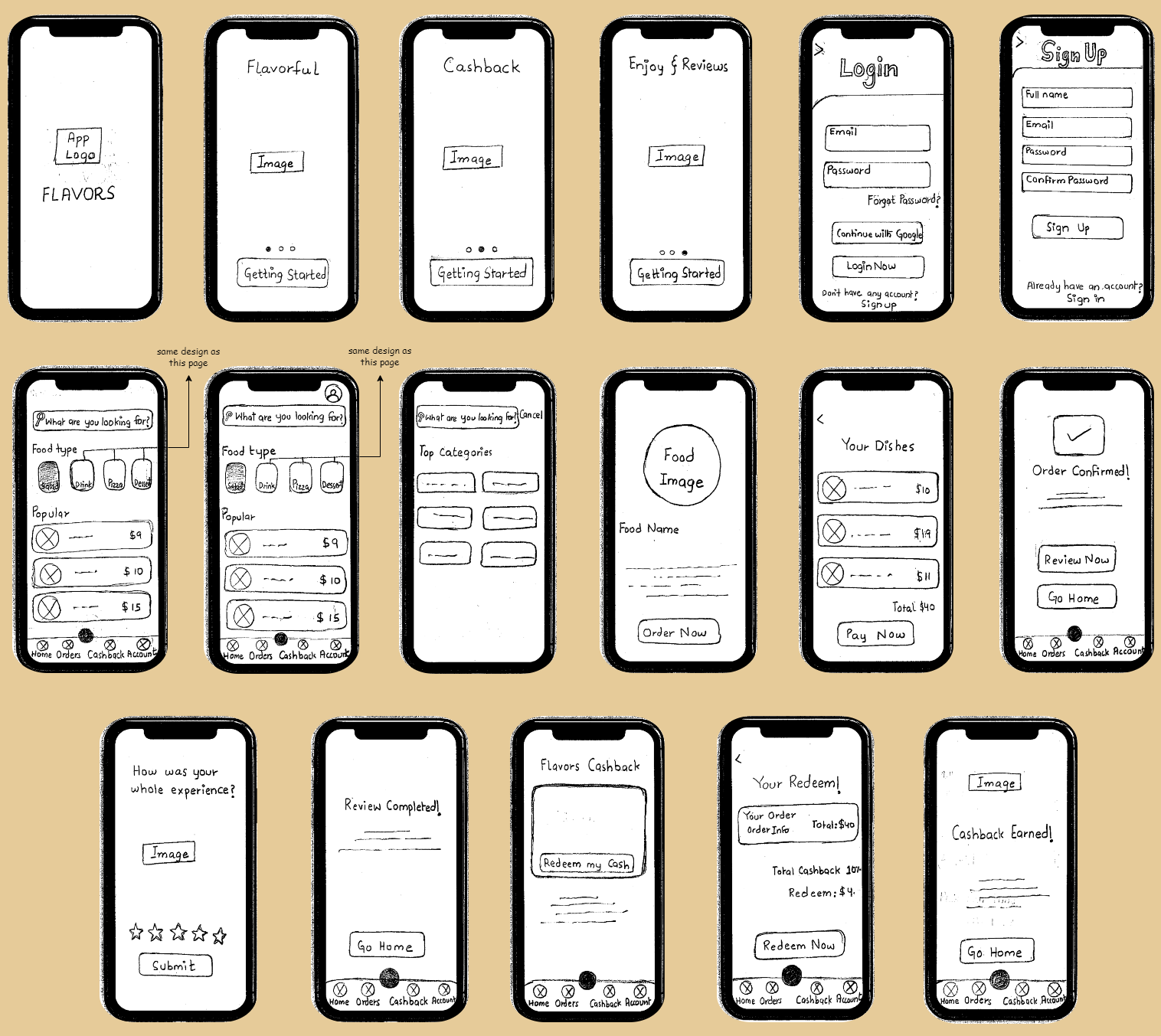
Sketches
The initial sketches for the app's fundamental design are shown below. These sketches were created because they are a quick, affordable, and effective way to visualize our ideas.
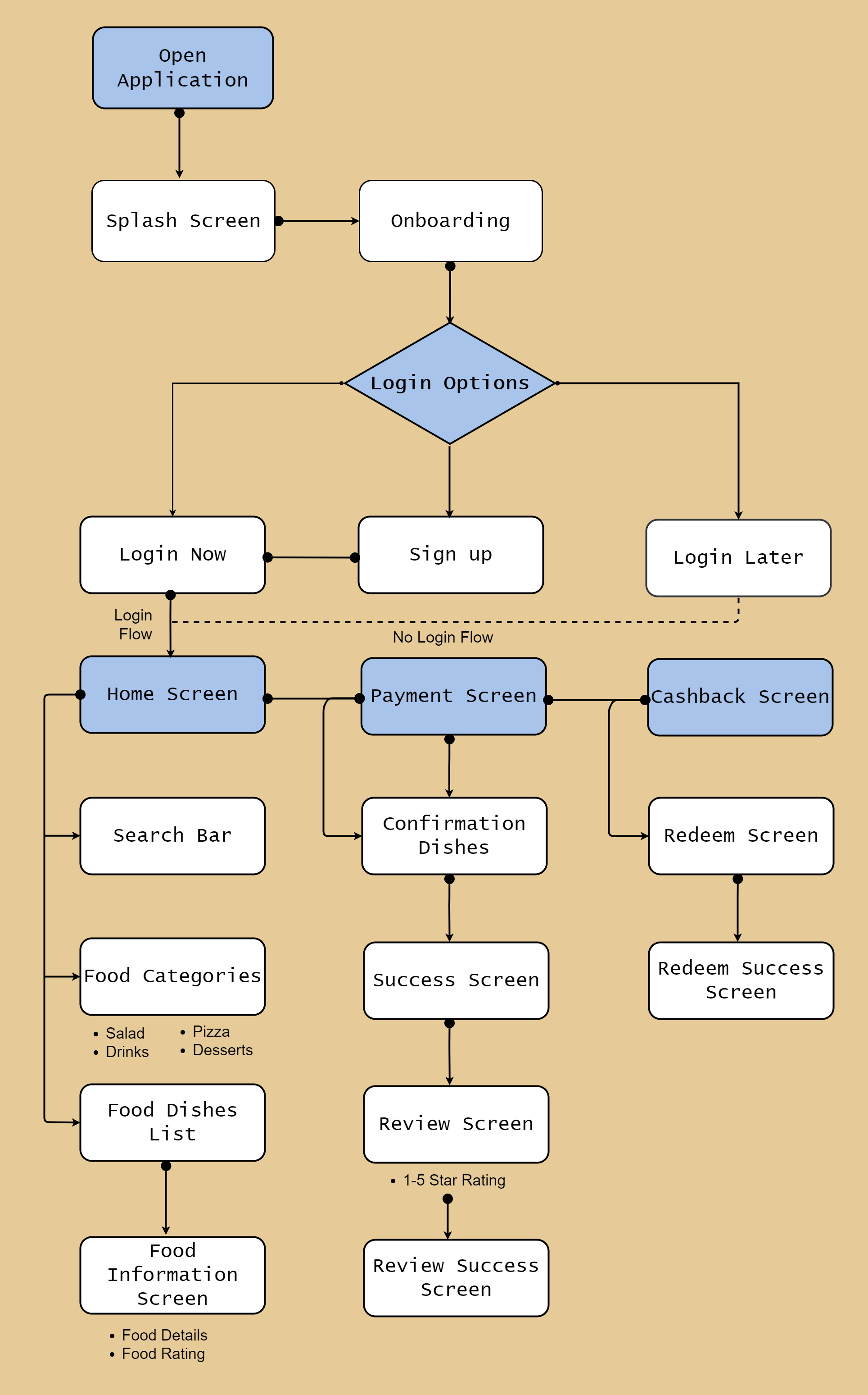
User Flow
Below is the user flow diagram that was employed to obtain a general understanding of the path that a user might take to achieve their objectives.
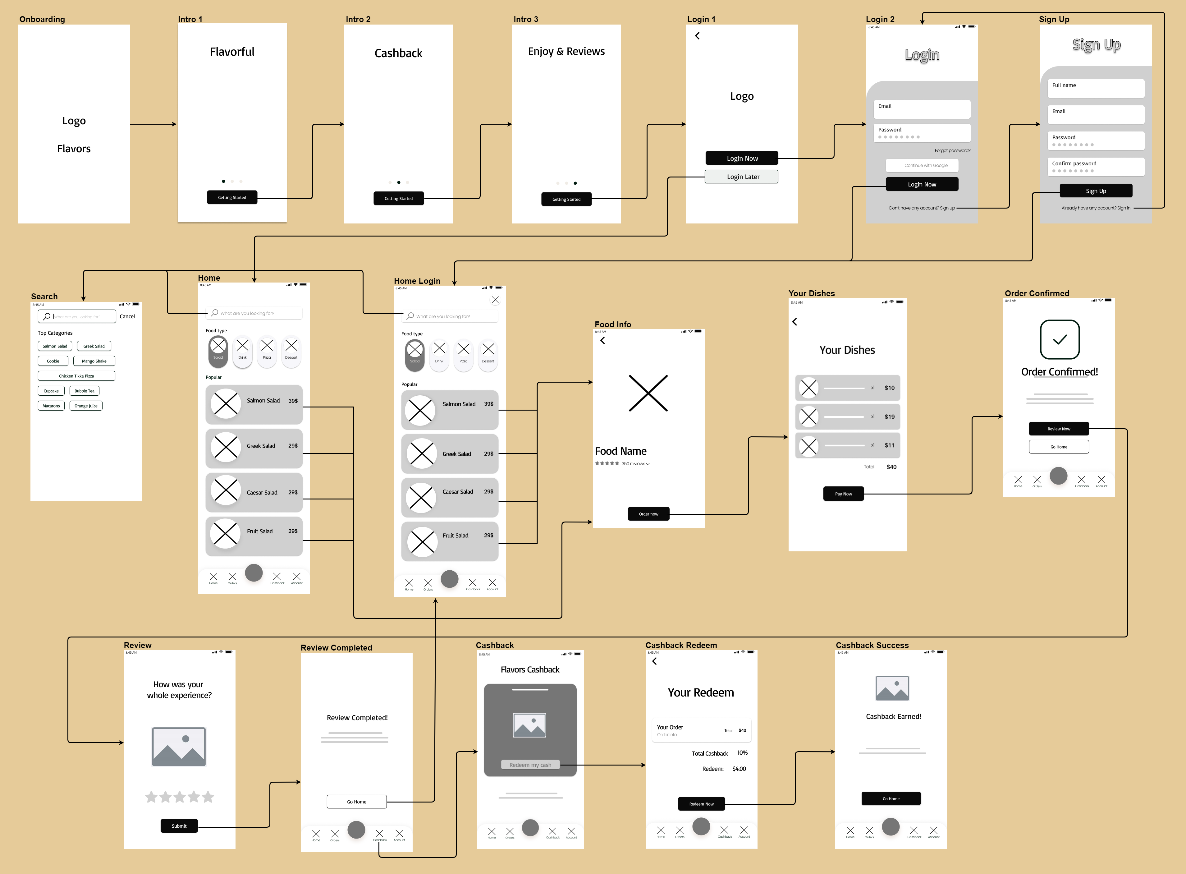
Wireframes
The sketches were then converted to wireframes. The overall structure and layout of the envisioned system are modeled in the wireframe below in a grayscale format. The wireframe is an intermediary step that brings us closer to the final product while focusing on the system's core functionalities.
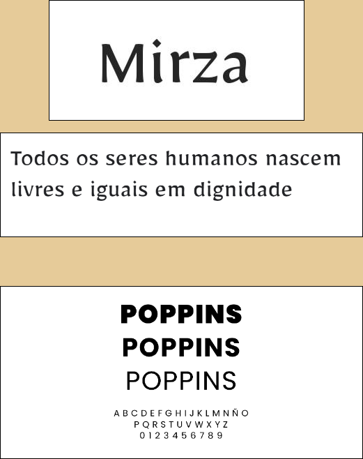
Typography
Typography is a key element of user interface design and has a significant effect in how aesthetically appealing a website can be. We ultimately settled on using the TrueType font "Mirza". In addition, "Poppins" is a different font that we chose for our app. Sans-Serif typefaces are characterized as having Poppins' typography. We choose to utilize this font for our application since it is a great option for both web and mobile applications.
Naming and Logos
The application's name and logo have a big impact on how users perceive it. Simply said, we called our app "Flavors" since the food at our restaurant is delicious and flavored. We went through different options to design logos for our application. We made a total of three logos and after discussion with the team, we agreed on the third option. We used a dish with a fork and spoon to represent our restaurant. These objects in the logo, despite being quite simple, are universally recognized and accepted as a representation of food from people of various ages, ethnicities, and languages. The logo alone will be sufficient to identify the app as it gains in popularity.
Final version
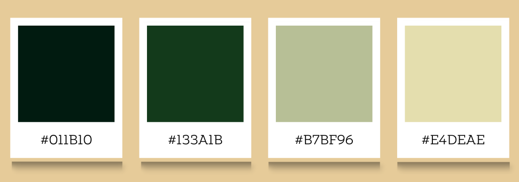
Colour Palatte
A carefully chosen color scheme can improve and support the overall success of the digital product. For this reason, we spent a significant amount of time brainstorming different color palettes. Many people experience persistent worry, ongoing anxiety, and tiredness as a result of the psychological repercussions of inflation. To ensure that our customers have a positive experience when using our app, we chose to consider these emotions. As a result, we opted to go with earthy tones such as various colors of green. The color green is associated with growth and prosperity, bringing wealth and the hope of a better future-exactly what our users need to feel at ease.
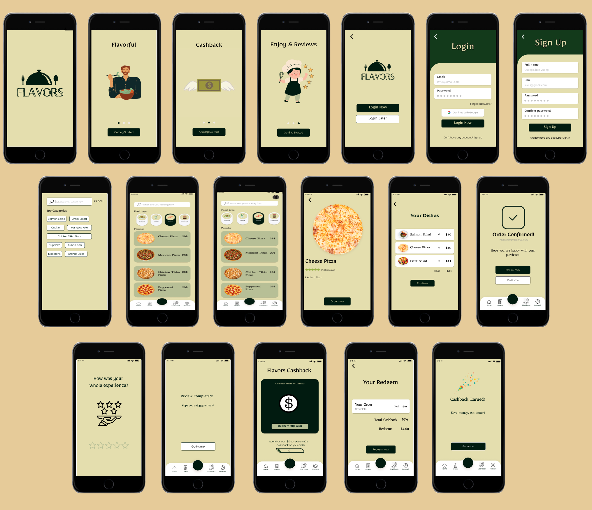
Mockups
Mockups give an excellent impression of how the final product will seem. The mockups were made to see how our app will appear after choosing the right colors, pictures, layouts, and fonts.
Prototype
The prototype below mimics the functionality of the future system as though it were computer-driven using the online tool Figma. Using this software, we'll be able to create and animate transitions between every page to observe how they all fit together and function.
Conclusion
Finally, the fundamental goal of our software was to enable users to dine at restaurants at a reasonable cost by utilizing a cashback feature. As not many competitors have this option, this will increase the revenue of the local restaurant "Flavors". The information presented above is a complete record of the thought process that went into each function and design aspect that was chosen for our application. Through this, we discovered the significance of the various methods and tools at our disposal (surveys, user personas, user journeys, user-flow diagrams, wireframes, mockups, prototypes, etc.) for assisting in the development of effective solutions that cater to the needs of users.
References
https://www150.statcan.gc.ca/n1/daily-quotidien/220119/dq220119b-eng.htm
https://tradingeconomics.com/canada/food-inflation#:~:text=Food%20Inflation%20in%20Canada%20averaged,percent%20in%20December%20of%201952